

You’re five days into a two-week sprint. Standups are quick, the board looks active, and nobody is raising flags. Then the last two days arrive – and the team is scrambling to close half the sprint backlog. It felt fine right up until it wasn’t. The Jira burndown chart exists precisely to prevent that moment, by showing you what’s really happening while there’s still time to do something about it.
What Is A Burndown Chart?
A burndown chart plots two things: how much work remains in your sprint, and the pace your team needs to maintain to finish everything on time. Think of it as a fuel gauge for your sprint – it doesn’t just tell you how much is left, it tells you whether you’re going to make it to the destination.
What Jira’s Native Burndown Chart Does Well – And Where It Stops
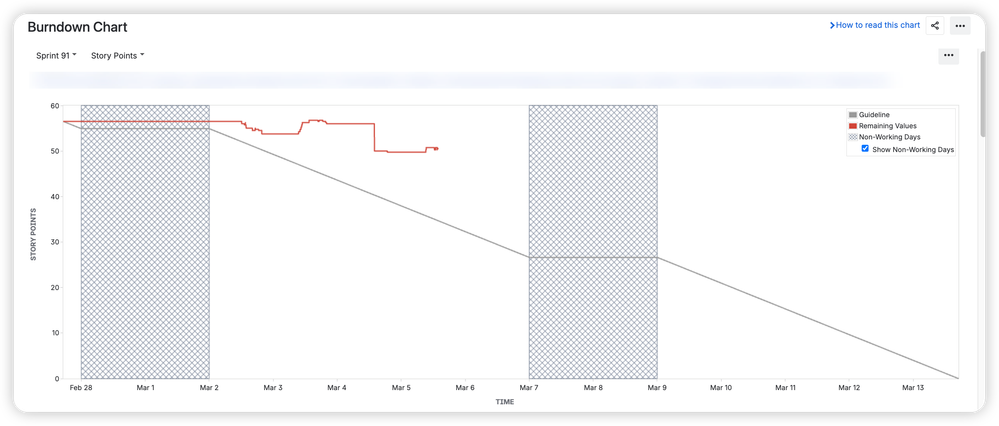
For a single team running focused sprints on one board, Jira’s built-in chart is a genuinely useful starting point. It draws two lines – remaining work and a straight guideline representing the ideal pace – and answers the most immediate question: are we on track this sprint?
That’s enough for many teams. But as delivery grows more complex, the native chart starts to show its limits.
It’s strictly sprint-scoped, so there’s no way to see remaining work toward a release spanning multiple sprints. It’s tied to a single board, meaning two teams contributing to the same goal have no shared view. There’s no forecasting – just actual vs. ideal, with no projection of when your team will realistically finish based on how they’ve actually been performing. And the chart is buried in the Reports section, invisible unless someone goes looking for it.
For teams managing real delivery pressure, those gaps matter.
What A More Complete Burndown View Looks Like
This is where Agile Burnup Burndown Charts by Broken Build extends the picture – and the difference is significant.
How To Read The Burndown Chart For Jira
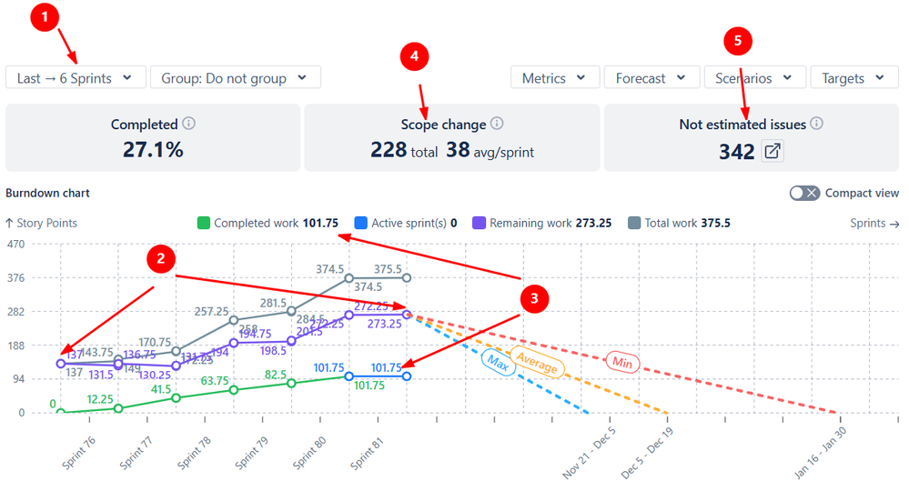
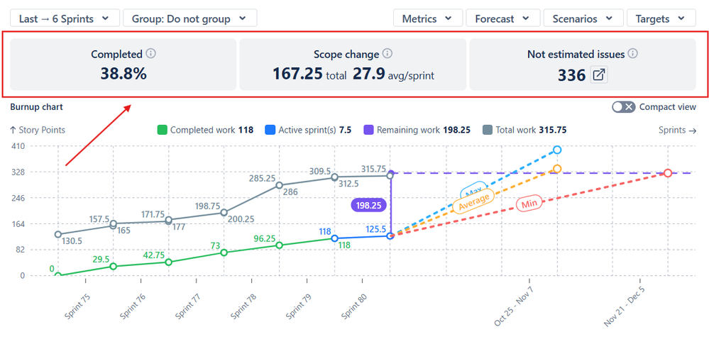
In the example below, the chart shows burndown for the last six sprints (1️⃣). During this period, the remaining work increased from 137 to 273.25 story points (2️⃣), even though 101.75 story points were delivered (3️⃣). This rise is explained by a scope increase of 228 story points, averaging 38 story points per sprint (4️⃣). In addition, 342 issues in the backlog are unestimated and therefore counted as 0 by default (5️⃣).
The Main Differences From The Native Jira Burndown Chart
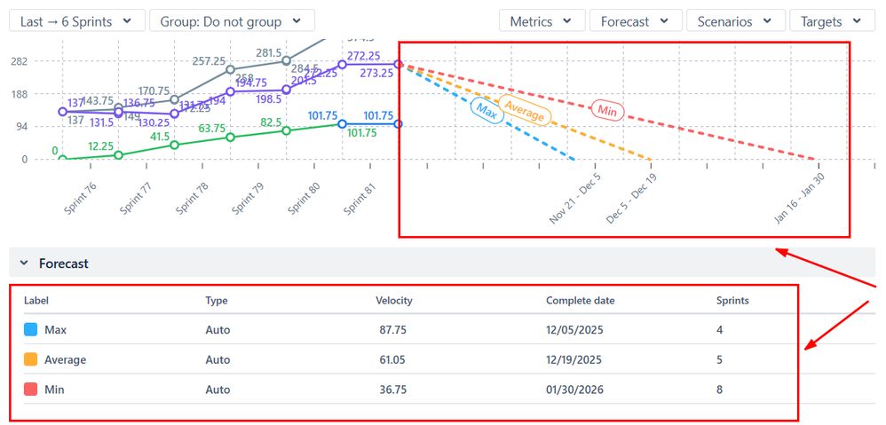
Instead of one ideal line, the chart generates three forecast lines based on your team’s minimum, average, and maximum historical velocity. Rather than comparing yourself to a theoretical perfect pace, you’re working with projections grounded in how your team actually delivers.
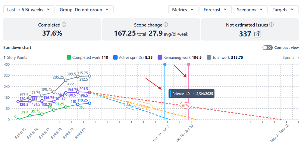
Target date overlays let you plot release dates or milestones directly on the chart, so the question “will we make it?” becomes immediately visual – weeks before the deadline, not days.
Health metrics displayed above the chart surface completion percentage, scope change, and unestimated issues at a glance. That last point matters: unestimated issues are counted as zero, which means your burndown can look healthier than it actually is. The health bar makes that gap visible before it becomes a surprise.
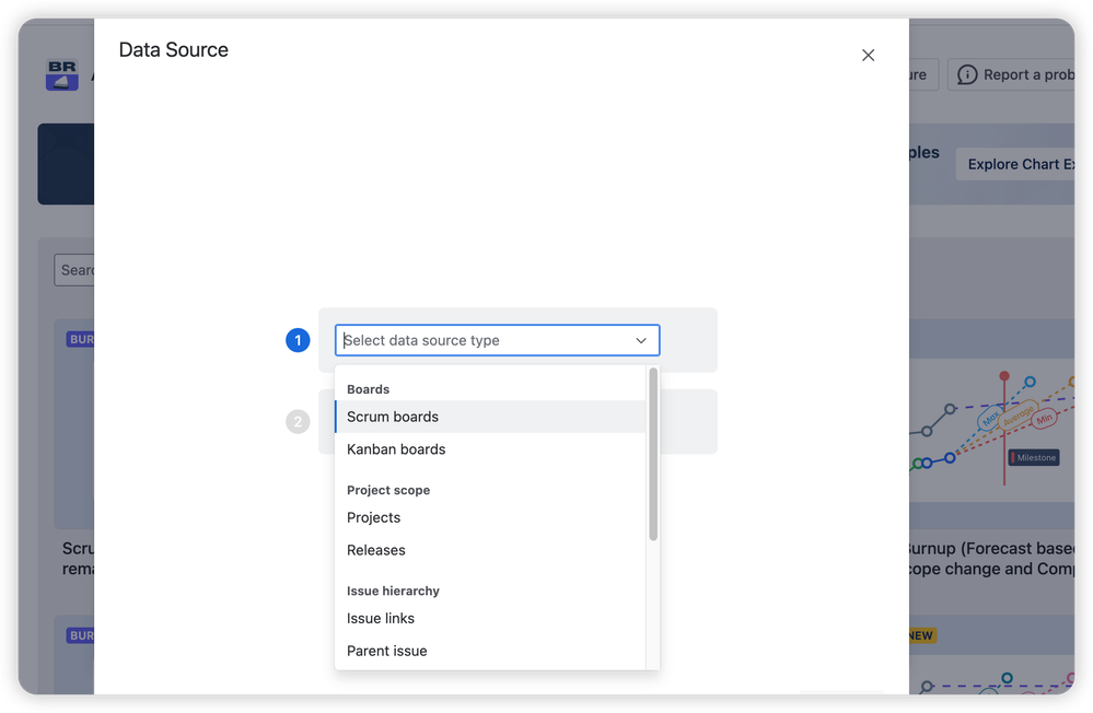
Flexible data sources tracking lets you build a burndown that spans multiple sprints, teams, and boards – all driven by projects, versions, epics, or custom JQL. Two teams, one release, one chart.
The result is a tool that doesn’t just report on the sprint – it informs decisions about it.
Your Sprint Data Has A Story To Tell
The burndown chart is the most accessible way to understand how your sprint is actually progressing – not how it feels. Start by opening it at your next standup. Look at where the line sits. Let the pattern drive the conversation.
Once that habit is in place, you’ll wonder what you were missing before. Explore the Jira burndown chart and see exactly what your sprint data has been trying to tell you.